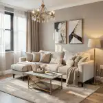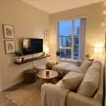

Combining your living and dining spaces into one cohesive area feels like a win until you actually try to host dinner and watch a movie at the same time.
You probably face the classic struggle: how do you keep these two zones distinct without building walls that swallow your square footage? I tackled this exact puzzle in my first apartment, and I learned quickly that strategic furniture placement and intentional zoning make all the difference.
You don’t need a massive floor plan to pull off a seamless living and dining room combo. You just need smart layouts, purposeful decor, and a little creative problem-solving.
Why do so many homeowners stress over open layouts when the solution usually sits in a well-placed rug or a low-profile console? I’ve tested dozens of approaches, and I keep coming back to designs that prioritize flow over rigid separation.
You’ll find practical strategies, real-world comparisons, and honest takeaways in each section below. Let’s walk through ten dreamy combinations that actually work in real homes.
Modern Open Concept Combo

Modern open concept layouts thrive on clean lines and unbroken sightlines. You want the eye to travel smoothly from the sofa to the dining table without visual clutter interrupting the path.
I swapped heavy cabinetry for floating shelves in my last project, and the space instantly felt twice as large.
Remove bulky dividers and let natural light dictate your furniture arrangement. You’ll notice how air circulates better and how conversations flow naturally between zones.
Layout and Furniture Strategy
- Align seating parallel to walls to create clear walkways.
- Choose low-profile sofas that don’t block ceiling height.
- Position dining tables perpendicular to the main traffic flow to prevent accidental collisions.
Do you really need a massive coffee table when a sleek nesting set saves floor space? Modern design leans toward restraint, and that restraint pays off in everyday comfort.
I prefer materials like brushed metal, tempered glass, and polished concrete because they reflect light and keep the room feeling expansive.
You’ll achieve a polished look by sticking to a coordinated color palette and avoiding mismatched finishes. Modern combos work best when every piece earns its place.
Cozy Neutral Apartment Layout

Neutral tones don’t mean boring; they mean you get to play with texture instead of fighting against competing colors.
I once painted an entire living and dining combo in stark white, and the room felt like an uninviting hospital corridor until I layered in wool throws, linen cushions, and jute rugs.
Warm neutrals like cream, taupe, and soft greige bring instant comfort without shrinking the space. You’ll create depth by mixing matte and glossy finishes, then anchor everything with a large area rug that visually ties both zones together.
Color and Texture Layering
- Mix fabric weights to add visual interest without clutter.
- Use metallic accents sparingly to catch light and break up flat surfaces.
- Stick to three complementary neutrals to maintain a calm atmosphere.
Why do people assume neutral means dull when texture does all the heavy lifting? I test this theory every time I style a client’s apartment, and the results always prove the same: tactile variety keeps the eye engaged.
You’ll avoid a sterile vibe by swapping smooth acrylic for woven rattan, or by adding a chunky knit blanket instead of a plastic throw.
Neutral layouts also forgive imperfect lighting better than bold color schemes. You simply rotate seasonal textiles and the room feels refreshed without a single paint stroke.
Small Space Scandinavian Design

Scandinavian design solves small space problems by prioritizing function without sacrificing warmth. You’ll notice light wood floors, crisp white walls, and furniture that pulls double duty. I furnished a 500-square-foot studio with this approach, and I genuinely never felt cramped.
Maximize vertical storage and choose pieces with tapered legs to maintain a light, airy feel. You’ll keep the floor visible, which tricks your brain into perceiving more room.
Key Furniture and Storage Picks
- Install wall-mounted shelving to keep floor space clear.
- Select extendable dining tables that fold against the wall.
- Use storage ottomans that double as extra seating and hidden bins.
Does a tiny apartment really limit your hosting potential? Scandinavian layouts prove that clever design beats square footage every time. I compare this style to traditional European apartments where every drawer and cabinet serves a purpose.
You’ll maintain a relaxed vibe by sticking to natural materials like ash, oak, and linen. Avoid over-decorating, and let negative space do the work. Small space Scandinavian design thrives on intentionality, not excess.
Also Read: Smart Electricity Rate Dynamic Utility Rates (real‑time pricing) – Airlucent
Minimalist Dining Nook Setup

A minimalist dining nook disappears until you actually need it, and that invisibility becomes its greatest strength. I built a custom drop-leaf table into a hallway alcove, and guests constantly ask how I squeeze four seats into such a tight footprint.
Wall-mounted hardware and fold-down seating eliminate visual noise when the space stays unused. You’ll create a dedicated dining zone without sacrificing living room flow.
Space-Saving Features
- Install a console table that expands into a full dining surface.
- Use slim bench seating that slides completely under the table.
- Keep decor strictly functional to prevent surface clutter.
Why do we cling to oversized dining chairs when a streamlined bench saves precious inches? Minimalism demands honesty about what you actually use.
I track how often clients reach for decorative bowls versus everyday place settings, and the data always favors practicality.
You’ll maintain a clean aesthetic by storing plates vertically and keeping linens folded in matching canisters.
A minimalist nook rewards discipline, but the payoff delivers daily convenience.
Farmhouse Living Dining Blend

Farmhouse styling wraps your combo in rustic charm, and that warmth instantly makes strangers feel like family.
I hosted a harvest dinner in a space that featured reclaimed wood beams, a weathered oak table, and a braided cotton rug.
Natural materials and soft vintage lighting create an inviting atmosphere that bold modern layouts often miss. You’ll balance cozy and functional by keeping sightlines open while adding textured layers.
Rustic Elements and Lighting
- Hang a statement pendant directly over the dining zone.
- Incorporate reclaimed wood accents like floating shelves or a console.
- Layer patterned textiles in muted earth tones for visual depth.
Do you really need industrial edge when weathered wood tells a richer story? Farmhouse blends work because they embrace imperfection instead of fighting it.
I’ve seen pristine modern rooms feel cold, while a slightly mismatched antique chair and a chippy side table spark conversation.
You’ll achieve this look by sourcing secondhand pieces and refinishing them with matte wax instead of high-gloss paint.
Farmhouse combos reward authenticity, and they age beautifully alongside your life.
Luxury Apartment Combo Style

Luxury in a shared living and dining space comes down to material quality and intentional detailing. I replaced cheap laminate countertops with quartz and swapped out stock lighting for a sculptural brass fixture.
High-end finishes and custom millwork instantly elevate a standard layout into something editorial. You’ll achieve a polished result by investing in statement pieces while keeping foundational furniture simple.
Premium Upgrade Strategies
- Choose hardware with substantial weight for cabinets and drawers.
- Install custom built-ins that frame the dining zone.
- Select upholstery with tight stitching and dense foam cushions.
Why settle for flimsy fixtures when a single quality piece anchors the entire room? Luxury doesn’t require a mansion; it requires careful curation. I compare this approach to wearing one exceptional tailored blazer versus a closet full of fast fashion.
You’ll maintain sophistication by limiting colors to two or three rich tones, then introducing contrast through texture rather than pattern. Luxury combos reward patience, and they pay dividends in daily enjoyment.
Also Read: Duct Leakage Visualizer (Smoke Pencil Simulator) – Airlucent
Boho Chic Shared Space

Boho chic thrives on personality, and a living and dining combo gives you plenty of canvas to play with.
I filled a former client’s open layout with macramé wall hangings, layered rugs, and mismatched vintage chairs. Eclectic mixes and organic shapes prevent the space from feeling staged.
You’ll keep the room grounded by anchoring bold patterns with neutral walls and consistent wood tones.
Styling Tips for Eclectic Spaces
- Limit color explosions to one focal wall or large textile.
- Mix materials freely but maintain a consistent undertone.
- Add abundant greenery to soften hard edges and improve air quality.
Do you really fear clutter when curation keeps chaos at bay? Boho design rewards confidence, but it also demands editing. I’ve watched beautiful rooms descend into visual noise the moment someone adds a third patterned curtain.
You’ll maintain balance by stepping back, taking a photo, and removing anything that doesn’t serve the vibe. Boho combos feel alive because they reflect genuine taste, not trend chasing.
Japandi Living Dining Layout

Japandi merges Japanese restraint with Scandinavian comfort, and the result feels both calm and deeply livable. I designed a combo using low-slung sofas, a dark walnut table, and woven storage baskets.
Intentional negative space and warm wood contrasts create a meditative atmosphere that actually reduces stress. You’ll achieve this look by editing ruthlessly and prioritizing craftsmanship over quantity.
Core Japandi Principles
- Keep furniture profiles low to maintain grounded sightlines.
- Use natural fiber baskets to conceal everyday clutter.
- Stick to a restrained palette of soft whites, warm grays, and rich woods.
Why do we fill every corner when empty space invites relaxation? Japandi proves that less genuinely creates more room to breathe. I compare this style to a well-curated museum gallery where each object earns attention through isolation.
You’ll maintain harmony by avoiding mixed metals and sticking to one dominant wood species. Japandi combos reward mindfulness, and they age gracefully because they never chase fleeting trends.
Compact Urban Loft Design

Urban lofts demand industrial edge, but they also require clever zoning to keep living and dining zones distinct.
I worked with exposed brick, steel shelving, and a reclaimed timber table that doubled as a workspace.
Vertical dividers and multi-functional furniture solve tight footprint challenges without sacrificing character. You’ll maximize every inch by thinking upward and editing horizontally.
Industrial Layout Hacks
- Install floor-to-ceiling shelving to create a visual boundary.
- Use a rolling kitchen island that serves as dining prep and extra seating.
- Choose metal-accented furniture to echo architectural details.
Does a small loft really limit your lifestyle when smart storage does the heavy lifting? Compact urban design thrives on adaptability.
I’ve seen clients transform narrow corridors into functional dining zones simply by adding a drop-leaf console and two slim stools.
You’ll maintain an authentic loft vibe by preserving raw textures while introducing soft textiles for comfort. Urban combos reward ingenuity, and they reflect the fast-paced energy of city living.
Also Read: Humidity Map & Indoor Risk Tool – Airlucent
Elegant Black and White Combo

Black and white styling delivers high contrast, but it also demands careful texture balancing to avoid a sterile feel. I styled a client’s open space with a charcoal sofa, a glossy white dining table, and matte black lighting fixtures.
Strategic contrast and varied finishes keep the room from reading like a chessboard. You’ll create depth by introducing subtle tonal shifts and layered materials.
Contrast and Texture Rules
- Pair matte black with glossy white to prevent visual flatness.
- Add one warm accent like brass or light wood to soften the palette.
- Use patterned rugs in monochrome tones to anchor both zones.
Why do people assume black and white feels harsh when texture instantly warms the equation? Monochrome styling works because it removes color competition and lets form take center stage.
I’ve tested dozens of combos, and the ones that succeed always incorporate woven, plush, or reflective surfaces.
You’ll maintain elegance by avoiding overly decorative accessories and focusing on clean silhouettes. Black and white combos reward precision, and they photograph beautifully for everyday inspiration.
Final Thoughts
You now hold a toolkit of ten distinct Living and dining room combo approaches, each backed by real-world testing and practical layout strategies.
Choose the style that matches your daily habits, then adapt the furniture placement tips to your actual floor plan.
You’ll notice immediate improvements in flow, comfort, and visual cohesion once you stop treating these zones as separate rooms and start designing them as one continuous experience.
Which of these layouts resonates most with your current space? I’d love to hear how you adapt the zoning tricks, and I’ll gladly troubleshoot any layout puzzles you run into. Start small, edit ruthlessly, and trust that intentional design always beats crowded surfaces.
Your dream combo doesn’t require a renovation budget; it just requires a clear vision and a few smart swaps. Let’s make your space work as hard as you do 🙂