Look, I get it. You walk into your bedroom after a long day, and instead of feeling that instant “ahhh” moment, you just feel… meh. Maybe your space screams chaos, or worse, it looks like a furniture showroom with zero personality.
Here’s the thing about neutral bedrooms—they’re not boring, they’re brilliant. I’ve spent way too many hours (and let’s be honest, way too much money) figuring out how to create that perfect sanctuary vibe, and I’m here to share what actually works.
Neutral doesn’t mean bland. It means you create a canvas where you can actually breathe, sleep like you mean it, and wake up without your eyes screaming at clashing colors.
Ready to transform your master bedroom into the comfort zone you deserve? Let’s talk about ten neutral bedroom ideas that’ll make you want to cancel your weekend plans and just stay in bed.
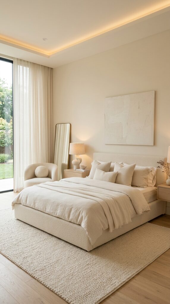
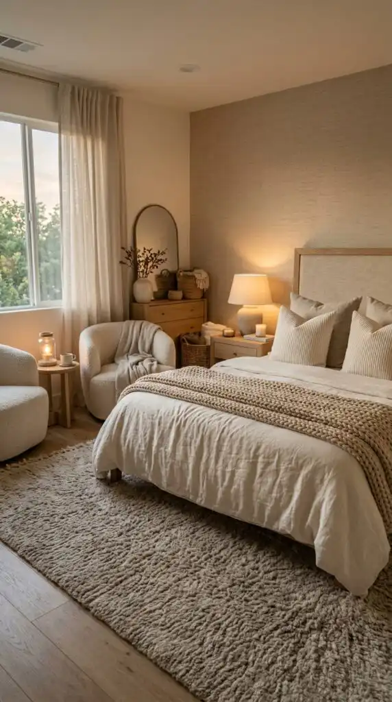
Warm Beige Sanctuary Bedroom
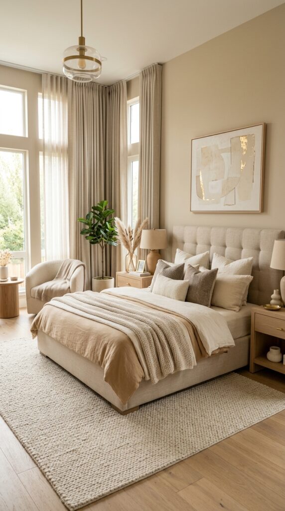
You know what’s seriously underrated? Beige. Yeah, I said it. Everyone acts like beige is the wallflower of the color world, but when you do it right, it’s like wrapping yourself in a warm hug.
I transformed my own bedroom using warm beige tones last year, and honestly, it changed my entire morning routine. The key here is layering different shades of beige—think caramel walls, sandy linens, and maybe some mushroom-toned throw pillows. This creates depth instead of that flat, doctor’s office vibe nobody wants.
Building Your Beige Palette
Start with your base color on the walls. I recommend going slightly warmer than you think you need—paint always dries lighter, trust me on this one. Here’s what works:
- Wall color: Warm beige with undertones of yellow or peach
- Bedding: Layer different beige shades from light cream to deeper tan
- Accent pieces: Introduce terracotta, burnt orange, or rust for visual interest
- Flooring: Light or medium wood tones complement beige beautifully
The magic happens when natural light hits these warm tones. You’ll notice your space feels instantly cozier, almost like you’re in a really expensive spa where people whisper and bring you cucumber water.
Texture Is Your Best Friend
Here’s where most people mess up—they pick beige and forget about texture. Big mistake. You need tactile variety to keep things interesting. Mix your smooth cotton sheets with a chunky knit throw. Add a jute rug. Throw in some linen curtains.
Every surface doesn’t need to be Instagram-perfect. Actually, a little lived-in texture makes the space feel more authentic and way less staged.
Layered Linen Neutral Retreat
Can we talk about linen for a second? This fabric is like that effortlessly cool friend who looks amazing without trying. I’m obsessed with creating an entire bedroom around this material, and you should be too.
The layered linen approach means you’re not just buying one linen duvet and calling it a day. You’re building an entire ecosystem of this beautiful, breathable fabric that somehow looks expensive and relaxed at the same time.
Creating Your Linen Layers
Start with your bed—because duh, that’s the focal point. I recommend these layers:
- Base layer: White or off-white linen fitted sheet
- Middle layer: Neutral linen flat sheet (try greige or warm gray)
- Duvet: Chunky linen duvet cover in oatmeal or natural flax
- Pillows: Mix linen euro shams with standard pillowcases
- Throw: Lightweight linen throw at the foot of the bed
The beauty here is the wrinkles. Yeah, you heard me right. Linen wrinkles, and that’s the whole point. You’re going for that “I woke up like this” vibe that costs $200 a night at boutique hotels.
Beyond the Bed
Don’t stop at bedding. I added linen curtains to my bedroom, and the way they filter morning light? Chef’s kiss. They soften everything without blocking the natural brightness you need to actually wake up.
Consider linen upholstery for a reading chair or bench. Add linen-covered storage boxes. The consistent material throughout creates visual flow that your brain registers as “calm” even if you can’t pinpoint why.
Modern Greige Master Suite
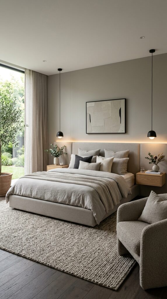
Greige—gray plus beige—is like the cool older sibling of both colors. It’s sophisticated without being cold, warm without being too cozy. IMO, it’s the perfect middle ground for people who can’t commit (no judgment, I’m one of them).
I fought the greige trend for years because it seemed too trendy. Then I actually tried it, and wow, I was wrong. This color works because it adapts to your lighting like a chameleon.
Nailing the Greige Balance
The trick is finding the right ratio. Too gray and your room feels like a winter storm. Too beige and you’ve just got… beige. Here’s my formula:
- Walls: Medium greige with slight warm undertones
- Ceiling: Lighter greige or soft white to lift the space
- Trim: Crisp white creates clean lines and definition
- Flooring: Medium to dark wood or gray-toned hardwood
You want contrast here. Greige-on-greige-on-greige makes everything blend together like a sad soup. Break it up with crisp white bedding, black accent pieces, or even some brushed brass hardware.
Modern Elements That Pop
Keep your furniture lines clean. You’re going for modern, so ditch the ornate carvings and fussy details. Think:
- Platform bed with a simple upholstered headboard
- Floating nightstands or ones with hairpin legs
- Geometric light fixtures in matte black or brass
- Minimalist artwork with bold lines
I added one large-scale abstract print above my bed in black, white, and greige tones. It ties everything together without overwhelming the space.
Also Read: 10 Fabulous Master Bedrooms Decor Inspiration for Bedroom Makeovers – Airlucent
Organic Earth Tone Bedroom
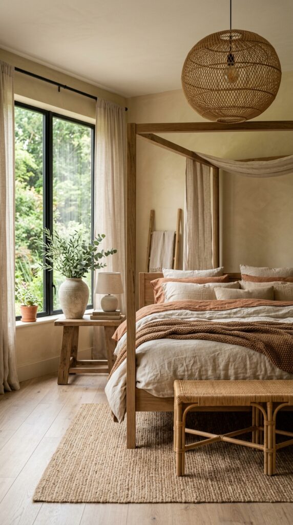
Ever walked into a room and felt like you could finally exhale? That’s what organic earth tones do. We’re talking terracotta, clay, warm browns, sandy tones—basically everything that reminds you of nature without actually sleeping outside.
This style speaks to my soul because it feels grounded. You’re not floating in some sterile white box; you’re creating a space that feels connected to the world beyond your four walls.
Building Your Earth Tone Foundation
Start with colors pulled directly from nature:
- Base neutrals: Cream, sand, warm white
- Mid-tones: Clay, terracotta, camel, warm taupe
- Deep accents: Chocolate brown, deep rust, charcoal
The key is keeping everything warm. Cool-toned earth tones feel contradictory and honestly just look muddy. Stick to warm undertones, and you can’t really mess this up.
Natural Materials Matter
This is where you bring in materials that actually come from the earth. I’m talking:
- Wood: Visible grain, warm finishes, maybe some live edge pieces
- Rattan or wicker: Headboard, baskets, light fixtures
- Stone: Table lamps, decorative objects, even small accent pieces
- Clay: Pottery, planters, sculptural elements
- Natural fiber rugs: Jute, sisal, or wool in earthy tones
Your bedroom should feel like it grew there naturally, not like you ordered everything from the same catalog in one panicked afternoon. Mix your materials and let them have conversations with each other.
Plant Life (Yes, Really)
FYI, adding actual plants takes this theme to the next level. I keep several low-maintenance plants in my bedroom—a snake plant in the corner, some pothos on the dresser. They purify the air and reinforce that organic, earthy vibe you’re creating.
Minimalist Cream Haven
Minimalism gets a bad rap for being cold and unwelcoming, but a minimalist cream bedroom is anything but. You’re stripping away the noise and keeping only what makes you feel peaceful. Revolutionary concept, right?
I’ll be honest—this one took me the longest to nail because minimalism is harder than it looks. You can’t just remove stuff and hope for the best. You need intention behind every single piece you keep.
The Minimalist Cream Formula
Your color palette is simple:
- Primary: Various shades of cream (warm whites, ivory, eggshell)
- Secondary: Warmer white for contrast
- Accent: Maybe one shade darker, like biscuit or almond
That’s it. You’re not adding pops of color. You’re not throwing in a “fun” pillow. You’re committing to the calm.
What Stays, What Goes
Here’s my brutal honesty approach to minimalist bedrooms:
Keep:
- Your bed (obviously) with simple cream bedding
- Two nightstands (or floating shelves) with one functional item each
- One statement light fixture
- Window treatments (keep it simple)
- Maybe one piece of meaningful art
- Storage that hides clutter
Lose:
- Decorative pillows that serve no purpose
- Knick-knacks collecting dust
- Excessive furniture
- Anything that doesn’t serve a function or bring genuine joy
I removed about 60% of the stuff from my bedroom when I went minimalist. The first week felt weird. The second week felt liberating. Now I can’t imagine going back to visual chaos.
Quality Over Quantity
When you own fewer things, you can afford to invest in better quality. That high-thread-count cream duvet cover you’ve been eyeing? Get it. Those solid wood nightstands instead of particle board? Worth every penny.
Your minimalist cream bedroom should feel luxurious in its simplicity, not sparse like you just moved in and haven’t unpacked yet.
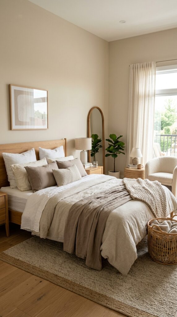
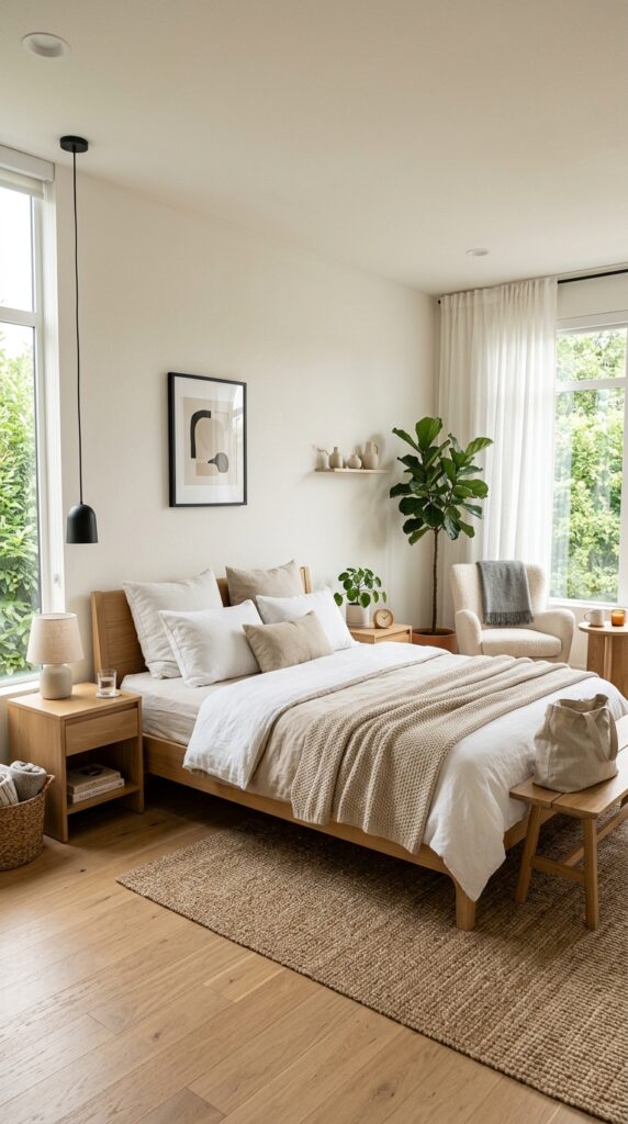
Neutral Bedroom with Wood Accents
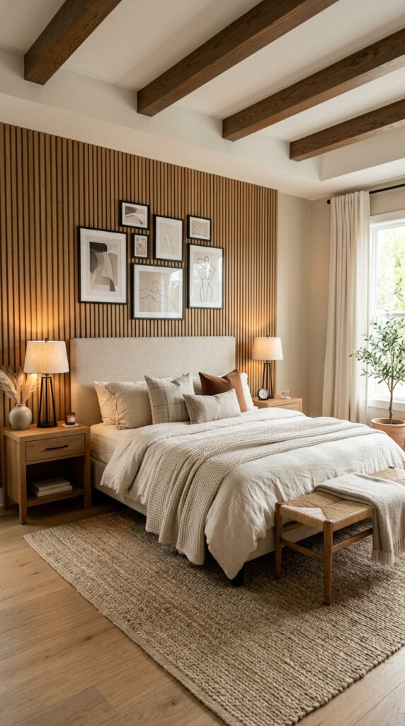
Wood brings warmth that paint colors just can’t match. I’m talking about visible, beautiful wood grain that adds character and grounds your neutral palette in something real and organic.
This approach works for literally everyone because wood is timeless. You’re not following a trend that’ll look dated in three years. You’re adding an element that humans have appreciated for thousands of years.
Strategic Wood Placement
You don’t need to wood-panel every wall (unless you’re going for cabin vibes, which is a whole different article). Here’s where wood makes the biggest impact:
- Headboard: Reclaimed wood, natural wood slats, or live edge
- Flooring: Hardwood in medium to warm tones
- Ceiling beams: If your room allows for it, exposed beams are amazing
- Furniture: Nightstands, dresser, bench at the foot of the bed
- Accent wall: Shiplap, wood planks, or even wallpaper with wood texture
I installed a simple DIY wood plank accent wall behind my bed, and the difference was immediate. The room went from “nice” to “I want to show everyone who visits.”
Mixing Wood Tones
Here’s something that took me forever to learn: you can mix wood tones. I used to think everything needed to match perfectly. Wrong. Life doesn’t match perfectly.
Combine your light oak nightstands with a darker walnut dresser. Mix your natural wood headboard with espresso picture frames. As long as you stick to either warm or cool undertones throughout, it works.
Balancing Wood and Neutrals
Too much wood overwhelms the space. You need breathing room. Use your neutral elements to give your eyes a place to rest:
- Crisp white bedding against dark wood creates stunning contrast
- Cream walls let wood furniture stand out
- Soft gray textiles cool down warm wood tones
- Light-colored rugs prevent the space from feeling too dark
The goal is balance. Wood provides the warmth and character, neutrals provide the calm.
Also Read: 10 Perfect Moody Master Bedrooms Decor Rich Aesthetic Spaces – Airlucent
Luxury Hotel Inspired Neutral Suite
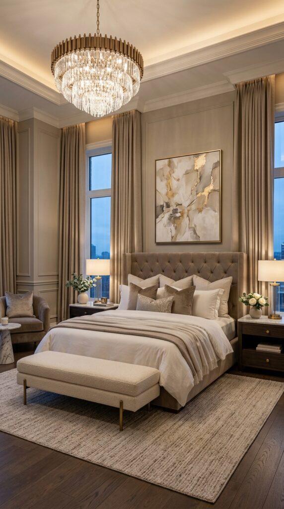
You know that feeling when you check into a really nice hotel and just want to face-plant onto that massive bed with its crispy white sheets and approximately 47 pillows? Yeah, you can create that at home.
I studied hotel rooms like it was my job (it wasn’t, but I was dedicated). The secret isn’t some impossible standard—it’s about specific choices that create that elevated, pampered feeling.
The Hotel Bed Formula
Hotels know beds. Here’s what they do right:
- High-quality mattress: This is non-negotiable
- Premium sheets: High thread count, usually white or cream
- Multiple pillows: Sleeping pillows plus decorative shams
- Duvet, not comforter: Hotels use duvets with removable covers
- Bed skirt or platform: Nothing underneath shows
- Throw or blanket: Folded at the foot of the bed
The color scheme stays neutral—whites, creams, soft grays, sometimes taupe. They avoid color because it needs to appeal to everyone, and honestly, that’s what creates the serene vibe.
Layer Like You Mean It
Hotels layer everything. You should too:
- Start with your fitted sheet (white or cream)
- Add your flat sheet (crisp white is classic)
- Layer a lightweight blanket
- Top with your duvet
- Add decorative pillows (but keep it reasonable—you still need to sleep here)
- Fold a throw at the foot
Make your bed every single day. I know, I know—but this one habit transforms your entire room. It takes three minutes and makes everything feel pulled together.
Luxury Details
It’s the small things that sell the hotel vibe:
- Matching nightstands: Symmetry feels intentional and upscale
- Table lamps instead of overhead lighting: Softer, more flattering
- Fresh flowers or greenery: Hotels always have this
- Tray on the dresser: Organize your everyday items elegantly
- Quality window treatments: Blackout curtains or layered treatments
- Nothing visible that doesn’t belong: No random piles of laundry :/
I keep a small tray with a candle and room spray on my nightstand. Takes two seconds to maintain, looks intentional, smells amazing.
Soft White and Taupe Escape
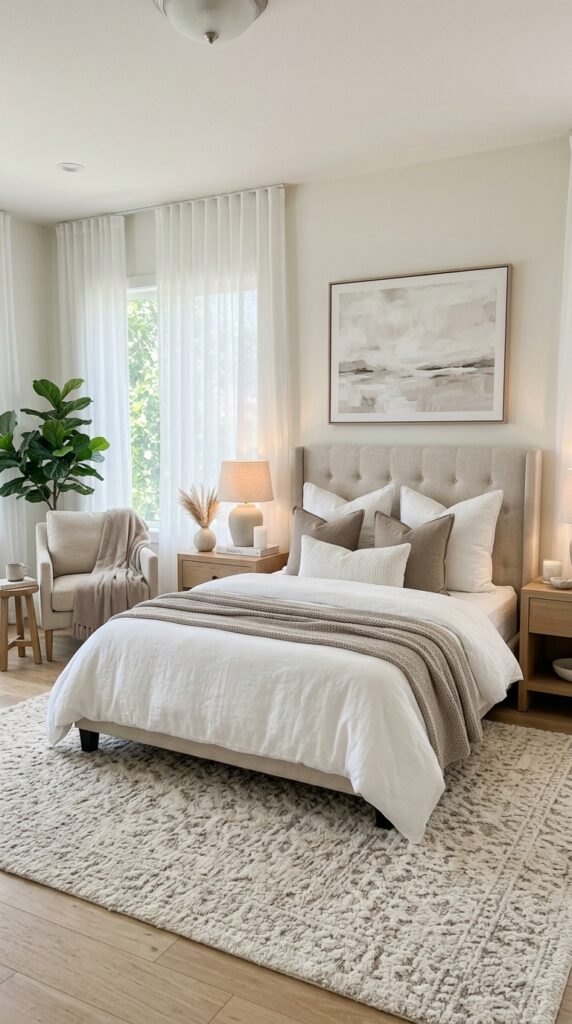
This combination is like the sophisticated older sister of beige and white. Taupe brings complexity that straight-up beige doesn’t have, while white keeps everything bright and airy. Together? Magic.
I love this palette for people who want neutral but worry about their space looking too bland. The contrast between soft white and taupe creates visual interest without introducing actual color.
Getting the Ratio Right
Here’s how I balanced these two colors:
- 60% soft white: Walls, ceiling, major bedding pieces, curtains
- 30% taupe: Upholstery, throw pillows, area rug, some textiles
- 10% deeper tones: Darker taupe or mushroom for accent pieces
This ratio keeps your room light and bright while the taupe elements ground the space and prevent it from feeling too sterile or cold.
Cool vs. Warm Taupe
Taupe comes in different flavors, and picking the wrong one makes everything look off. Cool taupe has gray or purple undertones—great if your room gets warm, direct sunlight. Warm taupe has beige or brown undertones—perfect for rooms with less natural light.
I tested at least five different taupe paint samples before finding the right one. Your lighting changes everything, so test your colors in the actual space before committing.
Texture Saves Everything
With such a subtle color palette, texture becomes your secret weapon:
- Mix matte and glossy finishes
- Combine smooth cotton with nubby linen
- Add a plush shag rug against sleek wood floors
- Layer different fabric weights
I have white linen curtains, a taupe velvet headboard, smooth white cotton sheets, and a chunky taupe knit throw. Every surface offers something different to look at and touch.
Cozy Textured Neutral Bedroom
Sometimes you want to create a space that’s basically a hug in room form. That’s where the cozy textured approach comes in. You’re still working with neutrals, but you’re cranking the comfort factor up to eleven.
This is my winter bedroom personality. When it’s cold and dark outside, I want my bedroom to feel like a cocoon where I can hibernate until spring.
Texture Layering Strategy
Forget matchy-matchy. You want varied textures that make your space feel collected and interesting:
- Bedding: Mix cable knit, faux fur, chunky knits, waffle weave
- Rugs: Layer a plush sheepskin over a larger jute rug
- Curtains: Heavy linen or even velvet for maximum coziness
- Pillows: Different fabrics—linen, velvet, bouclé, cotton
- Throws: Multiple weights and textures within your neutral palette
I probably have six different throw blankets in my bedroom. Excessive? Maybe. Comfortable? Absolutely.
Creating Visual Weight
Cozy rooms need some visual weight or they feel insubstantial. Here’s how you add it:
- Choose upholstered furniture over bare wood
- Use heavy, lined curtains instead of sheers
- Add a padded headboard (tufted or channel-stitched works great)
- Include a plush rug that your feet sink into
- Display books in small stacks
You want your eyes to move around the room and find soft, inviting surfaces everywhere they land.
Lighting for Coziness
Overhead lighting is the enemy of cozy. I said what I said. You need multiple light sources at different levels:
- Table lamps on nightstands (warm bulbs, please)
- Floor lamp in the corner
- String lights or LED strips for ambient glow
- Candles (real or fake, I won’t judge)
Dimmer switches changed my life. I installed them on every light in my bedroom so I can adjust the mood from “bright enough to find my phone” to “romantic cave.”
Also Read: 10 Lovely Master Bedrooms Decor: Cozy Peaceful Sleep Spaces – Airlucent
Scandinavian Neutral Master Retreat
Scandinavian design is basically the MVP of neutral bedrooms. It’s minimal without being cold, functional without being boring, and beautiful without trying too hard. Plus, these folks live in the dark half the year and still create bright, happy spaces—they clearly know something we don’t.
I fell hard for Scandi design because it proved you could have a simple room that still feels warm and inviting. It’s all about balance.
The Scandi Color Formula
Scandinavian bedrooms stick to a pretty specific palette:
- Primary: Soft whites and off-whites
- Secondary: Light gray, soft beige, pale wood tones
- Accents: Black for contrast, maybe soft blue or green
The whites are never stark or cold—they lean slightly warm to combat all that Nordic darkness. You want your white to feel like fresh snow in sunlight, not like a hospital.
Furniture Choices Matter
Scandinavian furniture has a distinct look:
- Clean lines: No ornate details or fussy carvings
- Light wood: Think blonde wood, ash, birch, light oak
- Functional design: Everything serves a purpose
- Low profile: Furniture sits closer to the ground
- Quality construction: Built to last, not trendy pieces
I replaced my heavy, dark furniture with lighter wood pieces, and my entire room felt bigger and brighter instantly. The visual weight of furniture seriously impacts how spacious your room feels.
The Hygge Factor
You can’t talk about Scandinavian design without mentioning hygge (pronounced “hoo-gah”)—that Danish concept of coziness and contentment. Here’s how you add it:
- Soft textiles in natural materials (wool, cotton, linen)
- Plenty of candles (Scandinavians burn candles like it’s their job)
- Natural elements (plants, wood, stone)
- Uncluttered surfaces
- Warm lighting
My Scandi-inspired bedroom has white walls, light wood furniture, gray linen bedding, and probably too many candles. It feels clean and organized but still warm enough to actually relax in.
Less Is More (But Make It Cozy)
Scandinavian design embraces minimalism, but it’s a warm minimalism. You’re not creating a sparse, empty room—you’re keeping only what you love and use. Every item should either be functional, beautiful, or both.
I keep a simple wool throw folded on my bed, one potted plant on my nightstand, and a single piece of art on the wall. That’s it, and it’s enough. The restraint lets me actually appreciate each piece instead of my eyes bouncing around trying to take in too much visual information.
Bringing It All Together
Look, I’ve thrown a lot of ideas at you, and maybe your head is spinning a little. That’s okay. Here’s the beautiful truth about neutral master bedrooms: you literally cannot mess this up.
Neutrals are forgiving. They work together. They create calm. They let you sleep without your eyeballs fighting with neon colors. Whether you go full minimalist cream or layer every texture known to humanity in beige and taupe, you’re creating a space that supports rest.
Start with one idea that speaks to you. Maybe you’re drawn to the organic earth tones, or perhaps that Scandinavian approach makes your heart happy. Pick your favorite, commit to it, and build from there.
And here’s my final piece of unsolicited advice: your bedroom should make you happy every single time you walk into it. Not in a “wow, this looks like Pinterest” way, but in a “this is my space and I feel good here” way. If your neutral bedroom doesn’t do that, keep tweaking until it does.
Your bedroom isn’t a museum. It’s where you rest, recharge, and escape from the chaos of everything else. Make it neutral, make it yours, and make it a place you actually want to spend time. You deserve a space that feels like the ultimate comfort zone—no matter which neutral palette gets you there.
Now go forth and create the calm, beautiful, neutral sanctuary you’ve been dreaming about. And maybe invest in better pillows while you’re at it. Trust me on this one.